A blog called Taxing Tennessee pointed me to this map from the Tax Foundation. Among other things, it shows the 10 worst and ten best states (in terms of state government’s debt). It is a per-capita debt, meaning that it represents big population states and little population states equally.
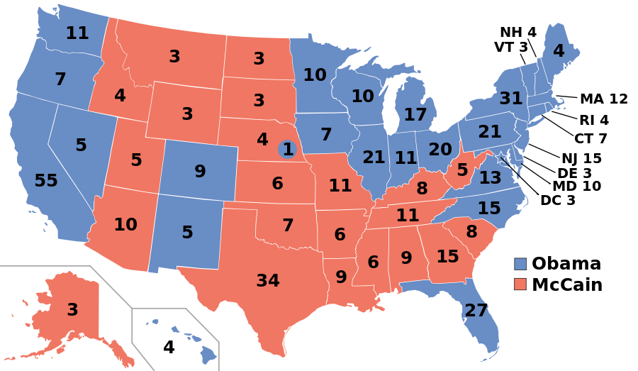
 I clicked over to wikipedia to find this map from the 2008 election. We’ve all seen it before but I’ll post it again for purposes of symmetry.
Obama carried 28 out of 50 states: 56% of them. In any random list of states you’d expect Obama to carry 56% of the list.
Of the fiscally worst states; Obama carried 90% of them. (Alaska being the only state preventing a full sweep.)
Of the fiscally best states; Obama carried 20% of them. (Minnesota and Nevada being the only states preventing a full “anit-sweep”.)
I could go nuts and conclude all sorts of things but I’ll just phrase two factual statements. The more indebted a citizen’s State Government the more likely that citizen is to have voted for Obama to lead the Federal Government. The more solvent a citizen’s State government the more likely that citizen is to have voted against Obama to lead the Federal Government. Those are facts which cannot be debated.
Now I’ll skate on thinner ice which is well supported but not utterly beyond discussion. “The evidence suggests that Citizens want their Federal Government just as indebted or solvent as their personal State’s Government.” I’m not going very far when I say that but I have indeed inferred causality from correlation. I’ll accept that it’s not an ironclad tautology.
Now I’ll get on my soapbox and add another statement which is almost a tautology. “As an American Citizen I can move from one state to another in search of fiscally responsible State Governance. (I have done so.) To move from one nation to another in search of fiscally responsible National Governance is vastly harder for any citizen.”
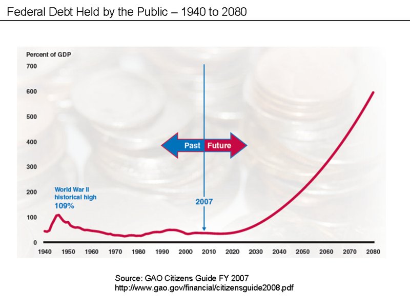
Here is another image I found on wikipedia.  I’m not going to beat a dead horse further. I just had to put up the first two maps because they were so well matched. The chart? Well I couldn’t help myself.
