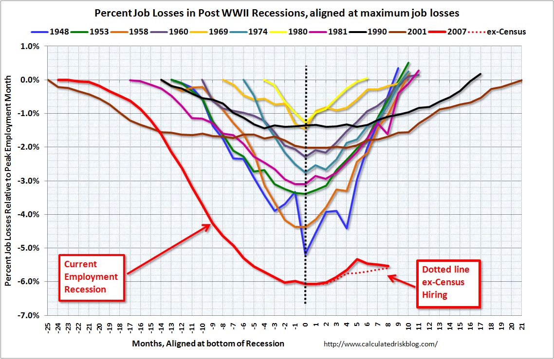
You’ll find this chart replicated all over the net. I sourced it from calculated risk but it’s referenced in countless other locations as well. I have no indication that it is incorrect.
Those of you who are bad at math or Obama fans can take a powder for the rest of this post. For everyone else I have a question. (You didn’t all bail did you?)
Don't blame me. I voted for Kang.
Let’s get the initial (and obvious) reactions out of the way:
- This is bad.
- This is not good.
- No matter how much the press tries to shove unicorns up your ass about how the recovery started an hour after Obama won the election, this is still weak economic performance augmented with turbo jets of suck.
- Printing a metric shitload of non-existent money didn’t help. See #3. (I am not surprised. There isn’t enough Kool Aid to convince me that amassing debt to destroy old Volvos magically creates prosperity.)
- This is the worst unemployment “shift” (flush?) since 1948. Seventy two years is a long time bubba!
- Grrrr.
Ok. Have we gotten all that out of our system? Good.
Because here’s my Curmudgeonly question. Why? Why should 2011 have so much unemployment for so much longer?
The previous seven decades had plenty of mismanagement. There have been wars, pestilence, drought, and disco. Why the long period of suck this time? How did did we eclipse everything since President Truman?
Never fear, I have a theory! Either I’m seeing an underlying reality or I’m way off. (Please comment. If I’m wrong I’d like to know so provide your interpretations! Hint: calling me an asshole is not a well reasoned argument.)
I believe that unemployment is higher now and is staying high longer because virtually everything we’ve done for decades has made unemployment a more tenable situation. Regardless of intention, most Federal fiscal policy can be viewed as if the goal was to keep people out of the workforce as long as possible…possibly most of their life. Perhaps the chart shows the demonstrable “success” of such policies?
Think about what differs between now and the past. You know what we didn’t have in 1948? Extended unemployment benefits. Surely cash payments make being unemployed a lot easier than otherwise. Nor did we have an unofficial immigration policy that counts on millions of illegals to be a shadow workforce. (Semantic note: they are not “undocumented”…they are illegal…as in breaking the law.) Reasonable people can disagree about immigration but surely illegals picking cabbages in a shadow economy distorts the documented worker’s economy. Regulatory hassles? In 1948 you told an employee to show up and paid them cash. If they sucked, you fired them. In 2011 you need an HR department to avoid lawsuits, an accounting department to generate 1099 forms, and firing anyone becomes an issue. Certainly that’ll discourage hiring.
And of course the biggest change of all is the rise of two wage earner households. When you lose one of two paychecks it’s dire. It’s also a common situation in 2011. Losing the single and only household support is 1948 style bad news and it’s catastrophic and total!
In 1948 you’d work, get paid, or starve. In 2011 there is a vast network of complexity that eases the transition from wage earner to welfare consumer. Presumably the better the welfare state and the more programs that smooth the transition…the longer a person is likely to stay unemployed. Why not?
BTW I’m not trying to disparage the unemployed. Getting laid off sucks…and it hurts. I’ve been there too. I’m just saying that welfare and it’s associated programs, regardless of intention, provide an incentive and opportunity to stay unemployed longer. Which is precisely what the chart is showing…more people are staying unemployed longer than we’ve seen since WWII.
So is the chart showing the “success” of policies that subsidize unemployment and penalize wage-earners? Of is it just the worst bad news in 70 years and me overthinking things?
Now, because I’m such an optimist, I’m going to add a ray of hope. It’s bad but it’s not 1939 bad. We’re not fighting on the streets for turnips. Kansas hasn’t gone Mad Max because rains screwed up the corn crop. Aside from Detroit (which is always screwed) and a few deeper blue states like New York, Illinois, California, and Minnesota (which all made decisions that are coming home to roost right now) the nation hasn’t totally shit the bed. The lights are on. The streets are filled with cars. Wal-mart still stocks food. People are still buying food. (Possibly more with welfare money and fewer with wage money?) Canada hasn’t attacked. The Russians haven’t launched ICBMs. The numbers suck but you can walk down a lot of streets in America and things superficially look ok.
This too would match my unusual interpretation of the chart. Policy has encouraged a situation where gainful employment in 2011 is a “lifestyle choice” as opposed to 1948 where gainful employment was the alternative to being a hobo and eating roadkill. (For the record, I once hit a deer with my car and after morning the car butchered the deer and stuck it in the freezer So I’m not making fun of hobos either.)
In the long term the numbers are bad. Making gainful employment an option is not a good thing for society. It’s not good here and it’s not good anywhere. (I can’t believe I’ve got to say that after we all watched mighty Russia collapse!) The EU’s problem children of Portugal, Italy, Ireland, Spain, and Greece are not a good portent. America’s problem children of over extended States is the same thing. So yeah, long term we’re all gonna’ die but does the dissonance between numbers that say “we’re going off a cliff” and a society that still has gas at the pumps and Nintendos in Wal-mart say that the welfare state is doing precisely what it was designed to do?